Balance History Bar Chart
Shows selected account balances over time as a bar chart. You can view a combined total, or stack each account separately, and optionally switch how the timeline is grouped with a frequency selector.
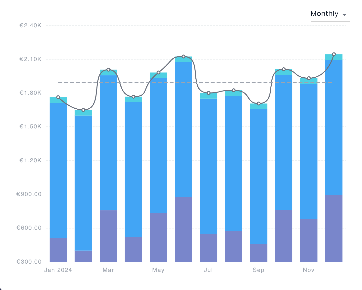
Example Use Cases
- Track how one or more account balances change over weeks, months, quarters, or years
- Compare several accounts over the same periods with stacked bars
- See the combined total balance across selected accounts for each period
Settings
- Accounts - Chooses which accounts are included in the chart.
- Use global commodity - When on, the chart uses the commodity set for the page. When off, you pick a commodity for this widget.
- Commodity - The commodity used to express balances. Shown only when Use global commodity is off.
- Include historical data - When on, shows historical balances by including postings from before the report start date. When off, shows only the change during the selected period.
- Show frequency selector - Shows a control on the chart to choose how balances are grouped over time (week, month, quarter, or year).
- Use global date - When on, the chart follows the date set for the page. When off, you can set a date for this widget.
- Date - The date range used for the chart. Shown only when Use global date is off. When Show frequency selector is on, the grouping comes from the frequency control instead of the date setting.
- Filter by description - Limits the chart to postings whose description matches the text you enter.
- Filter by tags - Limits the chart to postings that match the selected tags.
- Advanced expression - An optional hledger advanced expression for more precise control over which postings are included.
- Pricing - Controls how amounts are converted when pricing is needed.
- Price Evaluation Time - Chooses when market prices are applied for conversion.
- Infer market prices - When on, missing prices may be inferred from other available price information.
- Chart - Options that change how the bar chart looks and behaves.
- Inverse Y axis - Flips the value axis so higher and lower values switch places on the chart.
- Auto scale to fit - Adjusts the value axis so the bars fit the available space.
- Stacked - When on, each selected account is shown as its own series stacked in the bars. When off, the chart shows one series for the combined total.
- Show total line - Draws a line for the combined total across periods. Shown only when Stacked is on.
- Show average line - Draws a line for the average balance across periods. Shown only when Stacked is on.
- Color palette - Shifts which colors are used for the bars.
- Legend - Options that control the chart legend.
- Show legend - Shows a legend that labels the series in the chart.
- Legend Orientation - Chooses whether the legend is laid out horizontally or vertically. Shown only when Show legend is on.
- Legend Type - Chooses whether the legend is a fixed list or a scrollable list. Shown only when Show legend is on.