Subaccounts History Line Chart
Shows the balances of an account's sub-accounts over time as a line or area chart, with optional total and average lines.
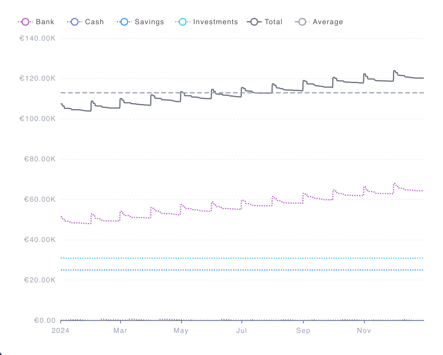
Example Use Cases
- Follow how each expense sub-category trends over time
- Compare asset sub-accounts under a parent account as lines or stacked areas
- Watch the parent total and average alongside the sub-account series
Settings
- Account - Chooses the parent account whose sub-account balances appear in the chart.
- Use global commodity - When on, the chart uses the commodity set for the page. When off, you pick a commodity for this widget.
- Commodity - The commodity used to express balances. Shown only when Use global commodity is off.
- Use global date - When on, the chart follows the date set for the page. When off, you can set a date for this widget.
- Date - The date range used for the chart. Shown only when Use global date is off.
- Filter by description - Limits the chart to postings whose description matches the text you enter.
- Filter by tags - Limits the chart to postings that match the selected tags.
- Advanced expression - An optional hledger advanced expression for more precise control over which postings are included.
- Pricing - Controls how amounts are converted when pricing is needed.
- Price Evaluation Time - Chooses when market prices are applied for conversion.
- Infer market prices - When on, missing prices may be inferred from other available price information.
- Chart - Options that change how the line or area chart looks and behaves.
- Chart type - Chooses whether balances are drawn as a line chart or an area chart.
- Smooth - Rounds the line paths so the chart looks smoother.
- Show symbol - Shows markers on each data point along the line.
- Show total line - Draws a line for the combined total across the timeline.
- Show average line - Draws a line for the average balance across the timeline.
- Inverse Y axis - Flips the value axis so higher and lower values switch places on the chart.
- Auto scale to fit - Adjusts the value axis so the series fit the available space.
- Color palette - Shifts which colors are used for the series.
- Legend - Options that control the chart legend.
- Show legend - Shows a legend that labels the series in the chart.
- Legend Orientation - Chooses whether the legend is laid out horizontally or vertically. Shown only when Show legend is on.
- Legend Type - Chooses whether the legend is a fixed list or a scrollable list. Shown only when Show legend is on.