Balance Pie Chart
Shows the balances of an account's sub-accounts as a pie chart. Useful when you want to see each sub-account's share of the total at a glance.
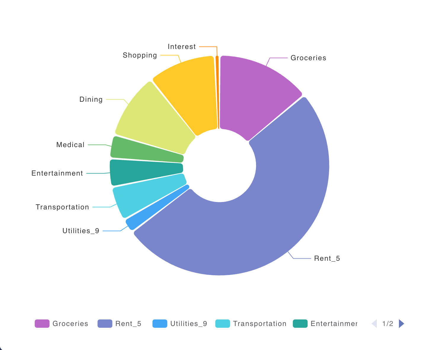
Example Use Cases
- See how your savings or investment sub-accounts split as a share of the total
- Compare expense category shares for a period
- Check the mix of asset sub-accounts under a parent account
Settings
- Account - Chooses the parent account whose sub-account balances appear in the chart.
- Use global commodity - When on, the chart uses the commodity set for the page. When off, you pick a commodity for this widget.
- Commodity - The commodity used to express balances. Shown only when Use global commodity is off.
- Include historical data - When on, shows historical balances by including postings from before the report start date. When off, shows only the change during the selected period.
- Use global date - When on, the chart follows the date set for the page. When off, you can set a date for this widget.
- Date - The date used for the chart. Shown only when Use global date is off.
- Filter balances by sign - Limits which sub-account balances appear: only positive, only negative, or both.
- Filter by description - Limits the chart to postings whose description matches the text you enter.
- Filter by tags - Limits the chart to postings that match the selected tags.
- Advanced expression - An optional hledger advanced expression for more precise control over which postings are included.
- Pricing - Controls how amounts are converted when pricing is needed.
- Price Evaluation Time - Chooses when market prices are applied for conversion.
- Infer market prices - When on, missing prices may be inferred from other available price information.
- Chart - Options that change how the pie chart looks and behaves.
- Rose Type - Chooses the pie style: Default uses a normal pie where slice angle shows each share; Radius uses a rose chart where both angle and distance from the center reflect each value; Area uses a rose chart where slices share the same angle and distance from the center shows each value.
- Show label - Shows the account name on each slice.
- Show tooltip - Shows a tooltip with more detail when you hover a slice.
- Color palette - Shifts which colors are used for the slices.
- Legend - Options that control the chart legend.
- Show legend - Shows a legend that labels the series in the chart.
- Legend Orientation - Chooses whether the legend is laid out horizontally or vertically. Shown only when Show legend is on.
- Legend Type - Chooses whether the legend is a fixed list or a scrollable list. Shown only when Show legend is on.